This post may contain affiliate links. Every link is hand-selected by our team, and it isn’t dependent on receiving a commission. You can view our full policy here.
As a kid, I bolted toward Tomorrowland at Disney World. Even though there were hardly any rides there that appealed to me, I relished in the kitschy, retro-futurism on display there. There was something so bizarrely fascinating about the architecture to me. It was hopeful and energetic, yet rooted in nostalgia. (Nowadays, that section of the park seems in desperate need of a facelift, but it’s not the bones of the place that need an update.)
It wasn’t until I spent an hour at the Neon Museum in Las Vegas that I suddenly found a name for the style — and started to understand why it mattered to me.
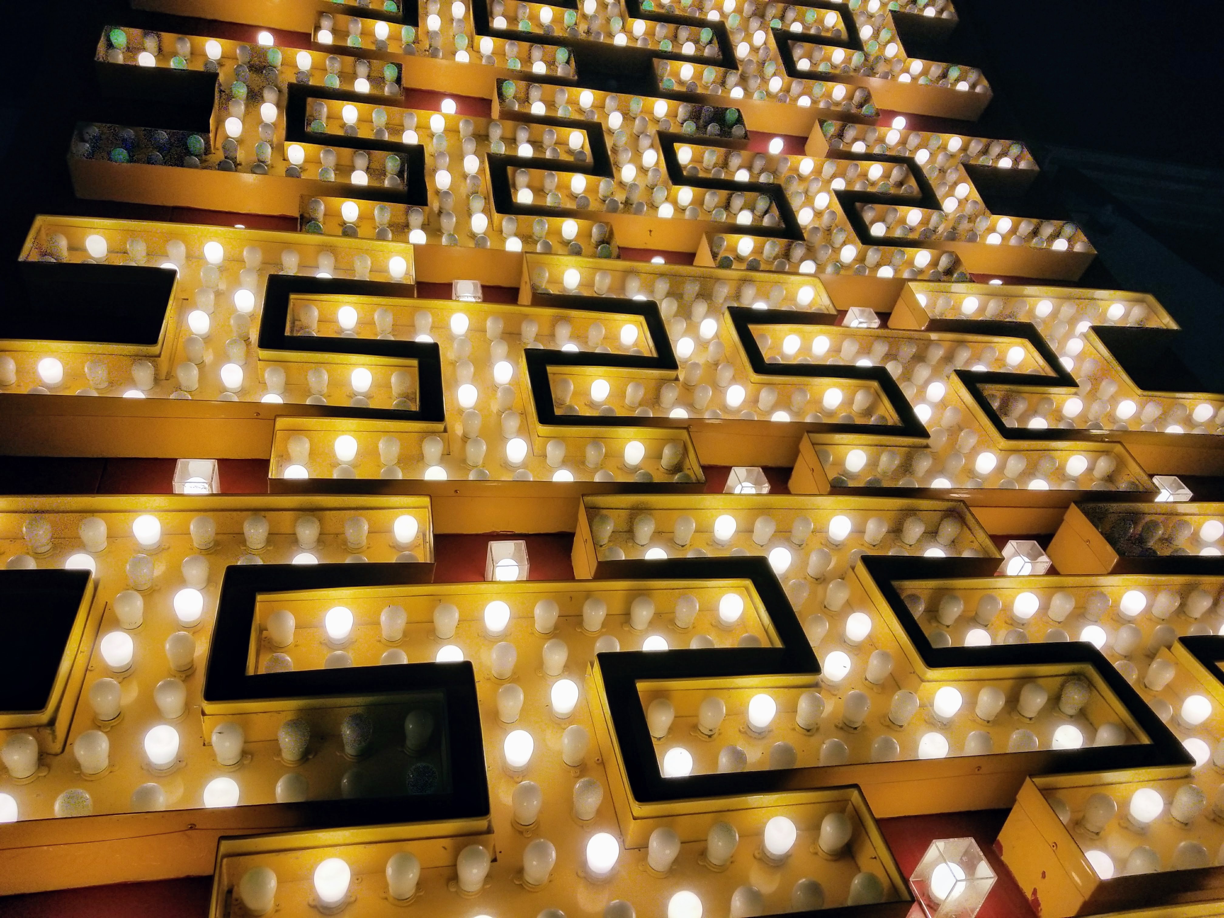
If you’ve ever been to Disney, road tripped through Florida, Las Vegas or California, or heck, watched The Jetsons, you’ve seen this style. It’s known as Googie architecture, and the name itself is actually a mockery of the style. Architecture critic Douglas Haskell coined it when criticizing the mid-century modern-feets-futuristic look back in the early ’50s. The design style — Sputnik-like starbursts, bubbly-shaped buildings, neon signs — became popular after World War II among commercial buildings, reported the Smithsonian. There was a huge interest in imagining a world of the future and making it real, and this exaggerated style seemed to embody that dream. The aesthetic was mostly used on commercial buildings, which needed a way to stand out from the crowd and get people’s attention as they zipped by in cars. (You may also know it as Populuxe design, a combo of popular + luxury. Iiiinteresting.)

By the early ’70s, when man had landed on the moon and the space race fervor had quieted, Googie fell out of fashion, in favor of more grounded, traditional styles.
It was a flash in the pan, in a sense, but I think that’s half the intrigue: There’s a magic to it. It’s a time capsule of a few decades when people seemed all too aware of mankind’s potential, and they were ready to squeeze every drop of juice from that lemon. There’s an unbridled, unabashed creativity to it, too. I think that’s what really resonates with me: Googie represents the ability to let your imagination run wild, something we don’t do too often anymore. You play pretend as a kid, and over time, you become more rigid, more practical. You stick to what’s cool, you fall in line. This design’s defiant — and whimsical.

I didn’t fully understand any of this as I stood in the “boneyard” of the Neon Museum, staring at the glowing sign for La Concha, a Googie motel whose massive cement clamshell has become the museum’s lobby. I just knew I liked it, and that something about its quirkiness struck a chord with me, prompting me to understand its origin. Here’s lookin’ at you, Googie, and here’s to thinking without limits.


